Designing an illustrated research recruitment poster
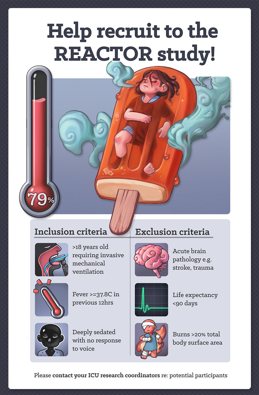
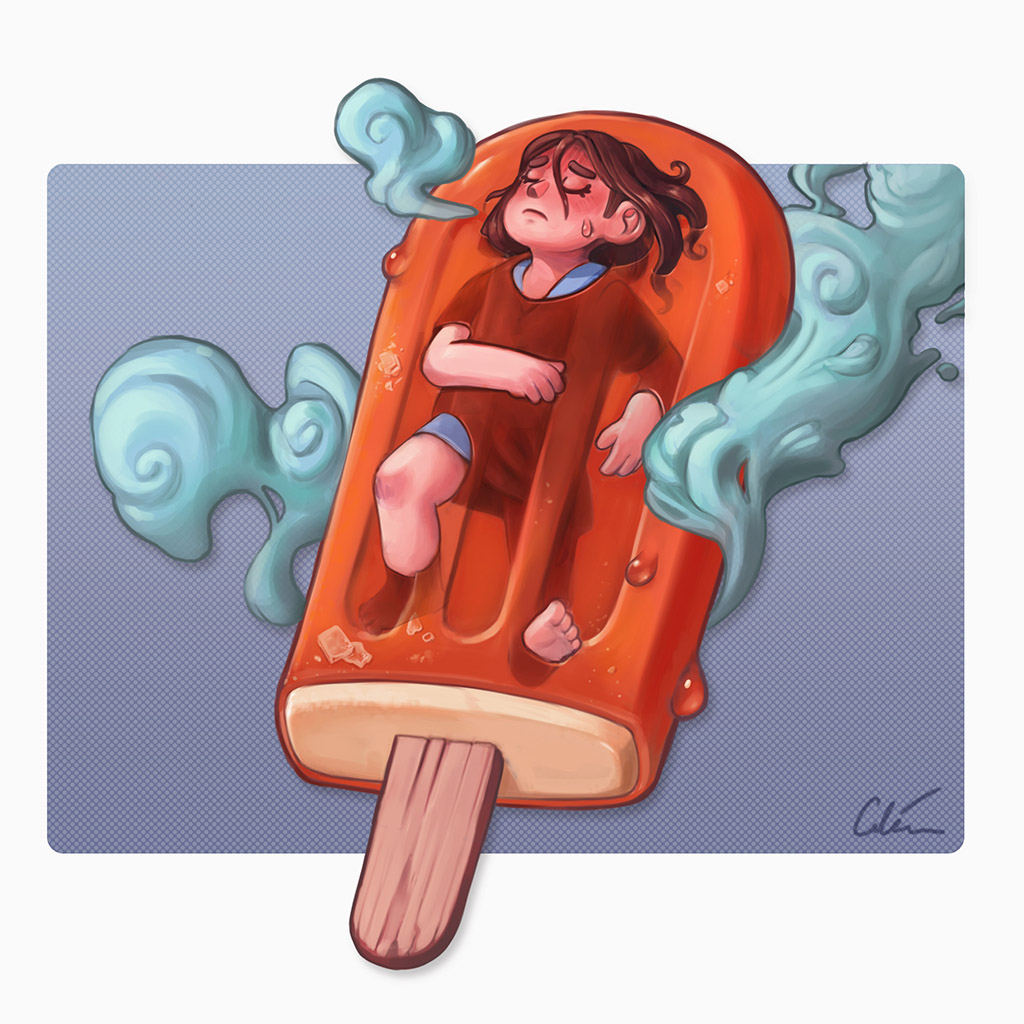
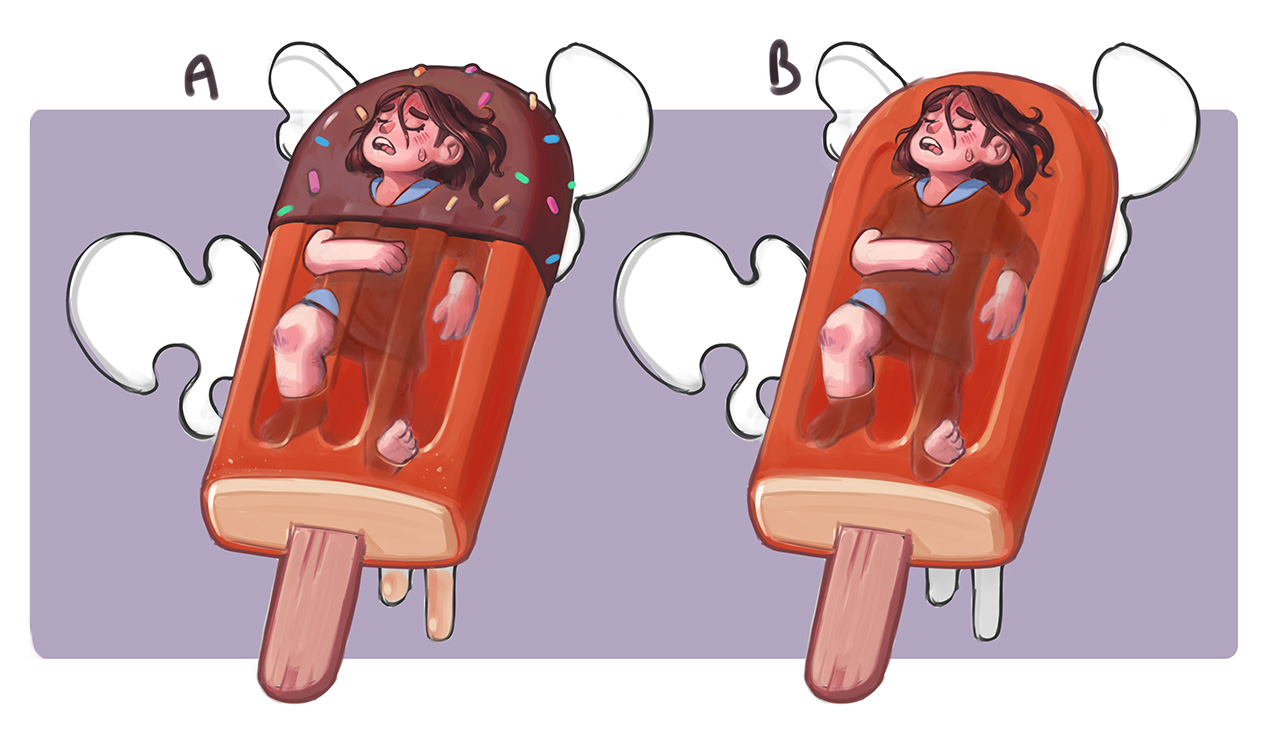
As requested by my followers; here is a walkthrough of how I designed a medical research recruitment poster, with commentary on thoughts behind the choices made.
The poster was aimed at medical staff in the ICU for a multi-centre study investigating aggressive temperature control in unconscious ICU patients with fever.
Skip to sections:
1. 0:10 Brief: have a clear message to say
2. 3:00 Word association to spark ideas for the illustrations
3. 4:46 Thumbnail, sketch, refine
4. 12:25 Rendering
5. 15:54 In context
6. 17:02 Icon design
7. 19:22 Summary
Note: this is a commentary on my design process for this particular challenge, rather than a technical tutorial on 'how to art', or solution for all poster design. Absorb the bits you find useful and ignore the rest. I'm happy to take questions in the comments if I've left anything unclear!
If you would like to support me opening up medicine through illustration check out my Patreon: https://www.patreon.com/artibiotics


