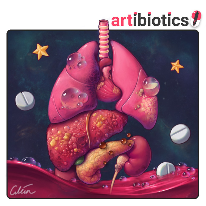
Artibiotics: the art of Dr Ciléin Kearns
The Journal of Visual Communication in Medicine recently invited me to write an article looking behind-the-scenes at my approach to medical illustration. I was absolutely honoured to be asked to contribute some thoughts from behind the scenes on what I do!
This post is a Green Open Access version of my article published in the Journal of Visual Communication in Medicine, which can be cited as follows:
Ciléin Kearns (2018) Artibiotics: the medical illustration of Dr Ciléin Kearns, Journal of Visual Communication in Medicine, DOI: 10.1080/17453054.2018.1465340
Artibiotics: the art of Dr Ciléin Kearns
Medical knowledge is often abstracted into walls of medical lingo, which mean little to most people. I love to break this down, and open up medicine with my art. I draw from a background as a Concept Artist for Sony PlayStation, and career in medicine as a Doctor. I have published academically and spoken across Europe on the intersection of medicine, surgery and art.
Superficial facial nerves at risk during head and neck skin surgery: for a video teaching surgeons how to approximate the course of these nerves from surface landmarks, to help avoid injuring them. It was important to me to frame the anatomical information in the context of a patient. I wanted her slight expression to remind surgeons of the real person their operative actions will affect.
Emotional resonance
The most important principle to me when illustrating is communicating a clear message that emotionally resonates with the viewer. This is the compass that guides my artistic choices through each project. Empathy means understanding the feelings of another; it is a powerful tool to communicate a memorable message that people want to engage with, scientific or otherwise.
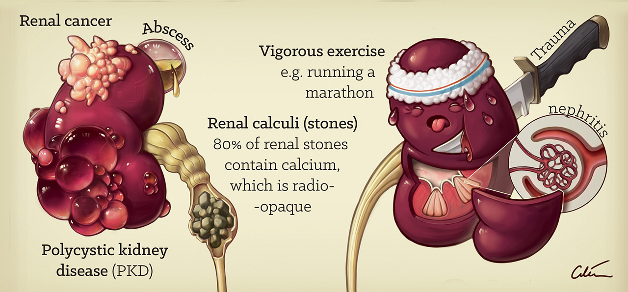
Renal causes of haematuria: excerpt from a poster summary of the important causes of blood in the urine. Here I have visualised pathology like landmarks across a map of the organs affected.
People inherently have an emotional understanding of core human needs such as food, love, and health. I try to harness this emotion, for example by personifying an organ with a worried expression, or using ‘cuteness’ to play to natural instincts to protect and care for our young. I also often reference food to influence how I paint biological materials. Diarrhoea is more aesthetic rendered like chocolate. Blood is more appealing like jelly. And so on!
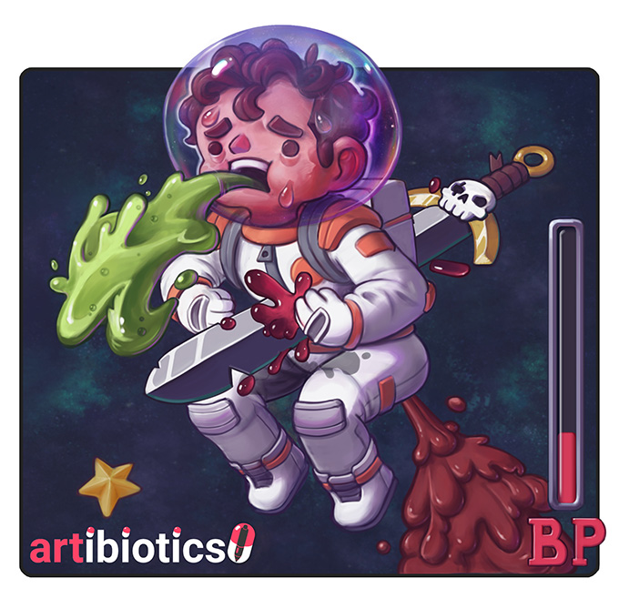
Hypovolemia: from my illustrated guide to the H’s & T’s, AKA reversible causes of cardiac arrest. This image was made to be striking. The character is sweating, vomiting, urinating, bleeding and suffering from diarrhoea. This summarises important causes of life-threatening fluid losses that can stop the heart through haemodynamic compromise, a vital concept to consider when trying to resuscitate a patient. Did you notice the jelly-like quality of the blood, and chocolatey texture of the poo?
Accuracy may not serve an unpleasant subject. For example, bloody intraoperative photography may be upsetting and repel engagement from patients and students. In contrast, crafting 'appeal' can draw interest to the repulsive, and make the dullest of concepts memorable. There is a lot to be learned from Disney on this matter. If interested, then read about the 'Nine old men', the 12 principles of animation, and the lecture notes of Walt Stanchfield.
Hypoxia: from my illustrated guide to the H’s & T’s, AKA reversible causes of cardiac arrest. Here, stylisation allows me to streamline detail and exaggerate the displacing effect of a pneumothorax. Both of these serve to make the pathology more evident at a glance. Air is invisible, but who cares? I use the pop-cultural shorthand of a puff of smoke to show its movement.
Stylisation
I love stylisation, which I see as the deliberate filtering of distracting information or ‘ noise’, leading to a clearer expression of the core message. The expert surgeon can easily pick out the structures that are relevant in their operative view. A trainee or patient, however, only sees a mess of bloody similarly coloured lumps and bumps of detail. When someone is learning something new they cannot filter out this noise.
Thrombus (pulmonary embolism and myocardial infarction): from my illustrated guide to the H’s & T’s, AKA reversible causes of cardiac arrest. Here, I have used light to represent blood flow, which creates a dramatic, clear, contrast to show tissue death beyond the point of the obstructing thrombus in the heart and lungs.
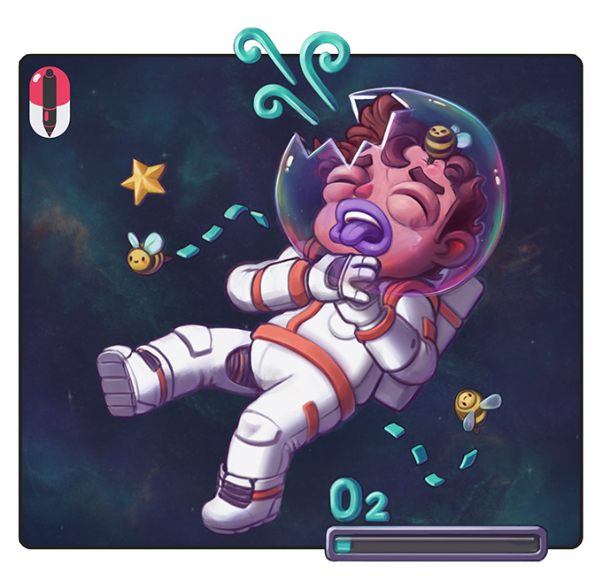
Hypoxia: from my illustrated guide to the H’s & T’s, AKA reversible causes of cardiac arrest. I leveraged a cartoon style to bend reality and serve the message of the piece. A zero-gravity environment in space allowed a free pose to lead the viewers eye. I leveraged iridescence and reflectivity of the helmet bubble to draw attention to the focal point. The physical proportions of the character with a large head allow exaggeration his anaphylaxis. The ‘space bees’ play to common knowledge that you cannot breathe in space, and that bee stings can cause life-threatening allergic reactions for some people.
I compare life to ‘ Where’ s Wally?’ puzzles, where there is too much information presented at once, much of which appears similar, even if you know what you are looking for. I see my job as clearing the noise and emphasising the information that matters. A simplified representation of reality makes the illustration faster to ‘read’ and easier to recall.
Rescue ASDH trial wings: here I have illustrated the two surgical management options that patients are assigned to in a large Neurosurgery clinical trial. Photography or video would have a limited view, making orientation difficult. Showing bloody surgery that is difficult to interpret out of context, to viewers without a background in surgical training, may be distressing and detrimental to objectively communicating pathology and treatment options.
My clean skulls orientate the viewer with familiar anatomy. The stylised dura (blue) are made more distinct in color to clearly stand out. There are no surgical tools, drapes, or hands to distract from the important details I wish to communicate.
Circle of Willis aneurysm rupture: I have illustrated a catastrophic aneurysm rupture in the brains blood supply. I elected to show the brain at this angle to demonstrate the Circle of Willis (red blood vessels) in context. It’s size, orientation, and relation to the brain is instantly clear. I used colour make a strong focal point, and took inspiration from Geysers to design a striking bleed. In contrast to the previous art, this time the message was served by accentuating blood, rather than hiding it.
Drawing from video game inspiration
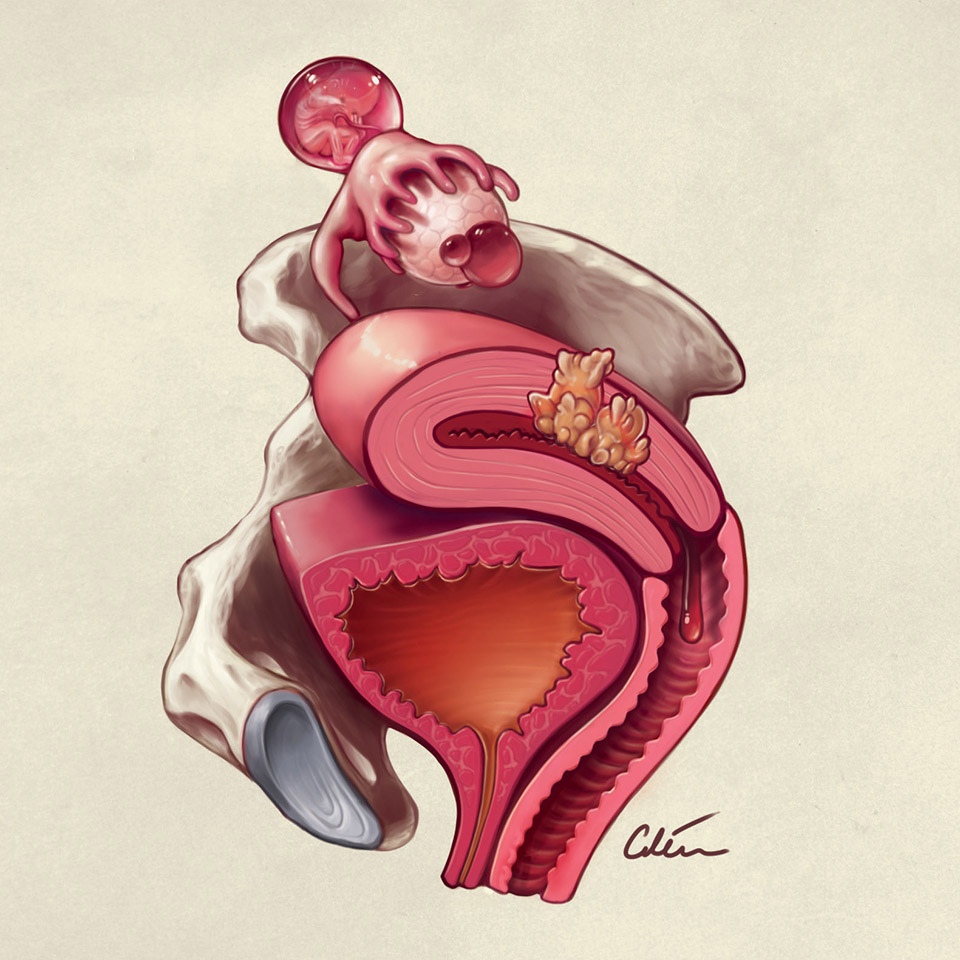
In the illustrations above I have illustrated 6 pathologies. In their original contexts, I challenged the viewers to hunt for these and figure out the connecting theme, before revealing the answers. I feel this sort of engagement is better for teaching than didactic lecturing, as the audience can participate actively. The left illustration shows gynaecology causes of haematuria, and the right shows causes of raised hydrogen ions.
My time spent working in the games industry influences my style, particularly when developing interactive animation and video, which allow the audience to be a part of the experience. Human brains are designed to enjoy solving puzzles, and games are crafted to harness this. They can make learning new skills, and overcoming increasingly difficult challenges, fun. I think anyone interested in education and communication can learn a lot from studying games!
Base of skull fracture signs: a summary of important clinical signs that point to a base of skull fracture, from an article I wrote and illustrated for my blog ‘artibiotics’.
Conclusion
I aim to make medicine and surgery a little more inclusive for everyone with my art. It has been an exciting journey so far, and I look forward to seeing where it takes me. Check out my medically illustrated blog 'artibiotics' and social media to follow my adventures!
Artibiotics, my medically illustrated blog: here I experiment with medical illustration, tackling health concepts in my own way. Examples include: breaking down injuries depicted in the video game 'Tomb Raider', analyzing wounds from 'Game of Thrones', and my own series 'Medical Mentalism', exploring what can be 'read at a glance' from the pattern of patients' clinical signs and symptoms. Search for 'artibiotics' on social media to follow my adventures!
This is a Green Open Access version of my article published in the Journal of Visual Communication in Medicine. It can be cited as follows:
Ciléin Kearns (2018) Artibiotics: the medical illustration of Dr Ciléin Kearns, Journal of Visual Communication in Medicine, DOI: 10.1080/17453054.2018.1465340


